
Mark Rothko’s interest in light and space is evident in any encounter with his work. But he was also the author of a theoretical treatise on artistic practice, never published in his lifetime, posthumously titled The Artist’s Reality (2004). Likely written in 1942-43 as the painter drifted away from the figuration of his earliest works, the book treats a wide range of concepts and problems: the use of archaic forms and ancient myth as sources; psychology and the physics of perception; the social-historical changes compelling painters to adjust their practice from demands of lordly benefactors to the vagaries of the market. It is organized according to a central hypothesis, that painting can be divided into two fundamental categories: the ‘illusory’, or ‘visual’, and the ‘tactile’. Like the Marx of the 1844 Manuscripts and the Theses on Feuerbach, Rothko dwells on sense-perception – this-sidedness (Diesseitigkeit) as the means by which painting discovered the truth, producing a ‘generalization’ of reality capable of reconciling subject and object.
Among the senses, it was not vision – as might be expected – but touch that Rothko considered to be elemental. Touch organized reality and confirmed the veracity of an object. Painting interested in truth therefore addressed depth perception as it might be experienced by touch, rather than proceeding according to the linear perspective of an imagined or idealized eye. Rothko designated this approach, whereby a painting took itself as its own object, as ‘plastic’. Rather than ‘conveying the illusion of appearance’, plastic artists – he gives the example of Egyptian wall painters – paid no heed to conventions of representation. For the plastic artist, ‘the subject of painting is the painting itself, which is a corporeal manifestation of the artist’s notion of reality’. The visual form, Rothko contended, had been dominant in Western art since the Renaissance in response to Platonism’s denigration of the world of appearance. Tactile plasticity, by contrast, staged the sensuous discovery of generic features of appearance.
Rothko’s opposing terms then were not appearance versus essence, but rather appearance versus the essence of appearance: Plato ‘could not foresee the development of the twentieth-century method for the representation of the essence of appearances through the abstraction of both shapes and senses’. Such representation held the promise of restoring a unity between subject and object which had prevailed in antiquity, much as Lukács looked to the ‘happy’ age of the Homeric epic which knew no division between inner and outer life. It is unlikely that Rothko would have read Lukács, but his theories bear a striking resemblance to those of Christopher Caudwell, who in Illusion and Reality developed a theory of the plastic arts in which ‘the visual sense…is eked out by tactile corrections’, and where ‘the affects do not inhere in the association of the things, but in the lines and forms and colours that compose them’. Caudwell’s principle is not unlike Rothko’s stated aim of raising painting to the level of poetry and music: ‘the philosophers of antiquity were her poets, who symbolized the ultimate unity of all that was considered reality in the created myths’. Ut pictura poesis.
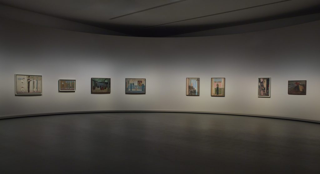
At the recent retrospective at the Fondation Louis Vuitton in Paris, curated by the artist’s son Christopher Rothko and Suzanne Pagé, two early figurative paintings already indicate something of this suspicion of the illusory and the visual. Movie Palace (1934-35), a dim, angled panorama of a cinema audience, depicts those attending with blacked-out eyes (also a feature of the contemporary self-portrait exhibited in the same room) or even nodding off, as is the case for the most recognizable feminine subject, who has propped up her head in her hands, eyelids shut. Contemplation (1937-38), meanwhile, depicts an elderly man, blonde with yellow skin, turned and looking away from a small globe towards a miniature window or rectangular image on the opposite wall; horizontally, the painting is divided by a cash register, with its red light on. A schematic rendering of a windowsill is beige, but the overwhelming backdrop is composed of two shades of black. This is not the only place where the ‘classical’ rectangular forms of the mature Rothko are already hidden in the background of the early work, but it is the most remarkable (though Rothko denied any correspondence).
Having dropped out of Yale to devote himself to painting, by the turn of the 1940s Rothko had abandoned figurative portraits and street scenes, including his well-known subway series, turning to a style he called ‘surrealist’. Such works, which set geometric or biomorphic forms against flat backdrops and relied on cubist rendering of multiple perspectives, carried titles indexing archaic myths, including those of Greece and Mesopotamia: Antigone (1939-40), Sacrifice of Iphigenia (1942), Tiresias (1944) and so on. The Greek gods were a lifelong, enduring symbol of the ‘limitations of human expression’. Rothko’s friendship with Clyfford Still and association with other abstract painters in New York informed a further movement away from figuration. Whether this was to be understood as concrete or abstract was an open question. In a 1946 catalogue essay, Rothko wrote that Still ‘expresses the tragic-religious drama which is generic to all Myths at all times . . . He is creating new counterparts to replace the old mythological hybrids who have lost their pertinence in the intervening centuries’. It was a matter, as he put it to Barnett Newman, of ‘further concretizing my symbols’. (A self-described ‘materialist’, Rothko would some years later contrast his work with that of the surrealists, who translated the real world into dream – he was rather insisting that ‘symbols were real’).
What followed was a period of the so-called multiforms: modular, abstract canvases, exhibited without frames, which abandoned line altogether and therefore the conventions of illusory perspective, even in heightened or self-reflexive cubist form. In works such as No.17/No.15 and No.14 (Golden Composition) Rothko developed the blurred rectangular structures common to the classical period, though in their earlier stages they are often vertically arranged and placed in a jigsaw pattern, without the discrete planes of the work of the 1950s. No.1 (1949) reintroduces some line, but only as outline, and incorporates the smoothed-over quadrangles in the stacked tripartite form of background, covered by a pseudo-foreground through the application of layers of thin paint above and below the viewer’s line of sight (Rothko insisted, famously, that his canvases be hung frameless close to the floor). These were the first of what are most recognizably Rothko in presentation. Untitled (1949) inaugurates the fully classical period. It is a large canvas. For Rothko, small pictures placed the viewer outside of the experience of viewing – one ‘looks upon an experience as a stereopticon’; but with a larger picture, ‘you are in it’.
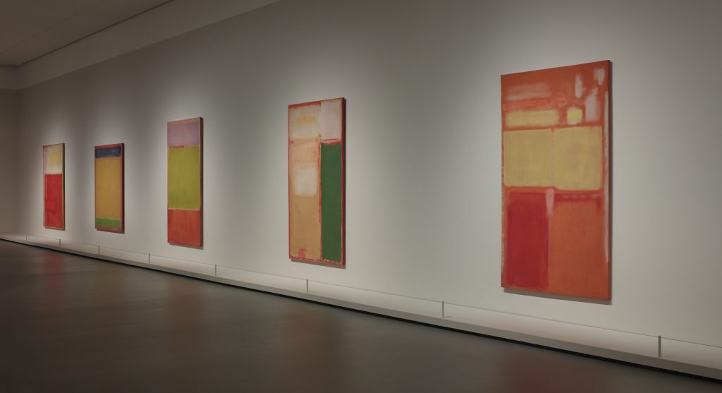
One remarkable painting, No.9/No.5/No. 18 (1952) – held by a private collection and hardly ever exhibited – suggests a small but significant concession to illusion. A navy-blue backdrop is all but blocked out by the brilliant red rectangle occupying nearly half of the canvas, and the corresponding ochre of the bottom third. What is notable is a narrower yellow rectangular band overlayed in the transition between the two. It is flanked by two lighter layers of the same yellow, extending nearly to the edge of the canvas, where the blue backdrop re-emerges. They are set at a slight angle, suggesting the imposition of perspective, albeit in a spectral way, and achieved without line itself. The presence of minimal illusion among its other elements makes this one of the most stirring compositions of the retrospective.
Elsewhere, among the classical Rothkos of the 1950s, one encounters other means by which depth, space and light are rendered without illusion: as in the rounded corners of quadrangles, their frayed edges giving the appearance of light while actually dispersing it. They evoke organic substances – contracting muscles or membranes – but these forms are generic and cannot be felt to refer to any specific physical body. They do, however, communicate the presence of the hand and its relation to the concept, as a pragmatics of seeing and perceiving. The Blackforms series of the mid-1960s make even greater demands on the viewer. Here, the little light which is not absorbed by these mammoth black canvases reflects back the reality of the mechanics of seeing – conjuring a monument to the effort expended by the viewer and the painter together in forging an image out of what at first appears to be monochromatic black.
Rothko was fastidious about the placement of his works. On various occasions – for the Phillips Collection, the Seagram Murals, the Rothko Chapel – he supervised the design of the room and not just the sequence of canvases. The first of these, dating to 1954-60, was recreated at the retrospective: three canvases surround a bench, their orientation insisted upon by the artist. The organization was undertaken with the aim of recruiting the viewer to better experience the physical process of perception – a process Rothko himself understood, in his own idiosyncratic definition, as psychological (psychology deals with ‘the mechanics of the sensual apparatus’). Although they are meant to be encountered by individual observers, Rothko argued that his paintings were part of ‘social action’. Politics was never absent in this process. A self-described liberal – and a committed anti-Communist who resigned in 1953, along with Adolph Gottlieb, from the Federation of Modern Painters and Sculptors he’d help found because it was insufficiently vigilant in the Cold War – Rothko was nevertheless highly suspicious of the ruling class which sponsored him, albeit belatedly, and of the art market itself.
This was partly what inspired his use of pre-capitalist antiquity as a model for his early 1940s theories. Not mediated by the market, the artist of antiquity was under no illusions about the nature of his relation to his benefactor, and for this reason those artists understood a social reality not easily accessible to artists of the capitalist (or ‘modern’) epoch. Rothko saw that ‘the market through its denial or affording of the means of sustenance, exerts the same compulsion’ as the direct compulsion of non-market societies, but with a ‘vital difference’. Ancient civilizations ‘had the temporal and spiritual power to summarily enforce their demands’; without this ‘dogmatic unity’, ‘instead of one voice, we have dozens issuing demands. There is no longer one truth, no single authority’.
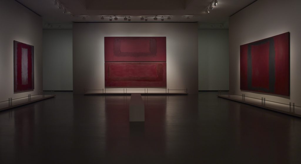
The Seagram Murals indicate something of Rothko’s conflict. Commissioned in 1958 by Philip Johnson’s Four Seasons restaurant in the Seagram building on Park Avenue, Rothko undertook their construction with ‘strictly malicious intentions’. He said that he’d hoped ‘to paint something that will ruin the appetite of every son of a bitch who ever eats in that room’ and that he intended to make ‘viewers feel that they are trapped in a room where all the doors and windows are bricked up, so that all they can do is butt their heads forever against the wall’. Over the course of a decade, a plainly anguished Rothko refused to deliver the work, and became convinced that the wealthy diners were too indifferent to be intimidated by his murals. He had anticipated – or maybe even orchestrated – this dispute, and had included a clause in his agreement, later exercised, allowing him to repossess the works should the room not meet his expectations. By 1969, he had arranged for the murals to be donated to the Tate. He was found dead in his kitchen of an evident suicide the day they were delivered to London in late February 1970.
The Seagram Murals are enormous wine-red and dark–brown tapestry-like canvases. Heavily layered, their forms – the outlines of columns and trapezoidal shapes – are conveyed more by texture and placement than by colour contrast. The gigantic Red on Maroon (1959) is actually a diptych, one portion hung atop the other, mimicking the quadrangular planes of his classical work; here, the small bit of gallery wall in between them is analogous to the layered background in the classical single canvases.
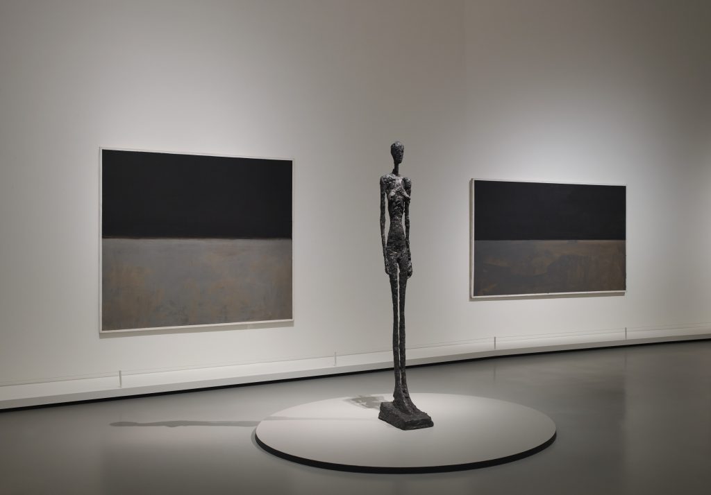
The exhibition concludes with the Black and Gray series, here shown with Giacometti sculptures as planned for an unrealized UNESCO commission. The curators attempt to rebut a common interpretation that these works evince symptoms of depression (by the end of his life, Rothko was being treated with the antidepressant Sinequan and suffering from numerous ailments, including an aneurism and high blood pressure). Contemporary with them, they point out, are some of the most vibrantly coloured works Rothko ever produced. Yet, if not morose, the Black and Gray works do appear to be anhedonic, or even anodyne. The effect is accentuated by two distinguishing features: the use of non-reflective acrylic imparts a shallower surface than those produced by Rothko’s typical mixture of oil and acrylic. Secondly, all but one of these works employ a border, achieved by half-inch tape applied during painting and leaving blank canvas exposed. Though abstract, they look more like representations, and share none of the immersive quality of other Rothkos.
Perhaps what they most resemble are minimalist mock photographs – the ironic staging of an illusory technique to represent a stereotype of the then-famous classic Rothkos. Rothko here appears to pursue the objectification of painting through illusory representation of his own work. ‘It is the camera that is chasing the artist’, he remarked in the Artist’s Reality, ‘chiaroscuro is the heart of photography’. These late works suggest by the last years of the sixties, the camera had begun to encroach on Rothko’s project. In this reading, the Black and Gray works are Rothko’s Parthian shot at illusion, one of the last in a lifelong effort to safeguard reality from it.
Read on: Hal Foster, ‘Art Agonistes’, NLR 8.